


This topic provides documentation of the screen elements within the application. Refer to the screen shots and numbered texts to find descriptions.
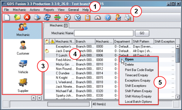
1. Menubar: This contains a horizontal list of Menu options directly beneath the title bar. The Menu options that are available will depend on the users location in the application.
2. Toolbar: The toolbar contains buttons that may be used to perform functions. When grey, the function is not available. The buttons are explained in the topic Fusion Icons.
3. Entity Options: The buttons here provide access to functions, they are listed in the topic Fusion Icons.
4. List View: Fusion uses many types of display to present information. The list view is divided into Rows and Record Columns. A Row can be selected by clicking on it.
5. Menu box: The Menu boxes contain lists of options. This menu box is accessed by highlighting a row in the list view and then clicking the right mouse button. The options available refer to the highlighted row.
6. From left to right, the standard window controls are Minimise, Maximise and Close.
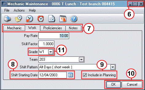
7. Tabs: Tabs are used when large amounts of information must be held on screen. As shown here, named tabs indicate that further information is available. Clicking the tab name will change the display.
8. Date Input Fields: Where dates are to be
entered, the Calendar button  will
also be available. Click the button to access the
calendar where the date can be selected. Use the buttons to the upper right
to change Year and Month. Use the centre button to move to the current Month.
Click on a date to select it and copy it to the Date Input field.
will
also be available. Click the button to access the
calendar where the date can be selected. Use the buttons to the upper right
to change Year and Month. Use the centre button to move to the current Month.
Click on a date to select it and copy it to the Date Input field.
9. Check Box: Check boxes present options that the user selects or clears. A tick appears in the box when it is selected.
10. Command Buttons: Command buttons are common to most windows and confirmation boxes. They provide commands like Yes, No, OK Cancel etc.
11. Drop – Down List Box: The provide a list of possible options for an input field. The user accessess them by clicking on the arrow button to the right of the filed and then makes a selection from the list that appears.
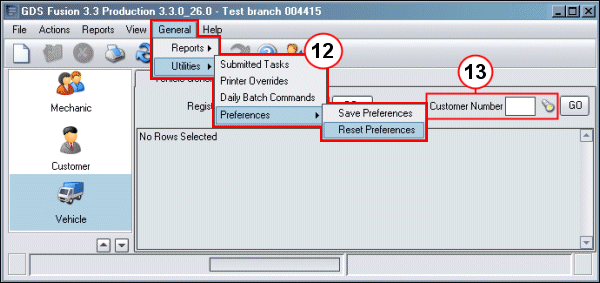
12. Drop-Down Menu: Drop-down menus contain Menu Items which can be selected by the user. Sub Menus may also be available for some items, these are indicated by the small black arrows and they expand automatically when the user moves the mouse over the item. When an item is grey it is not selectable.
13. Search button: When a
search is possible against a particular field then the tourch icon or Search
button  is available dirctly to the
right of the field.
is available dirctly to the
right of the field.